Blue Light Yokohama – Rebranding Identity
Blue light Yokohama is a small genuine Japanese restaurant located at the heart of Södermalm in Stockholm. They call themselves the most authentic Izakaya in town (Izakaya can be described as Japanese tapas). For over 10 years they have shown locals how to enjoy the Japanese cuisine in the most authentic way.
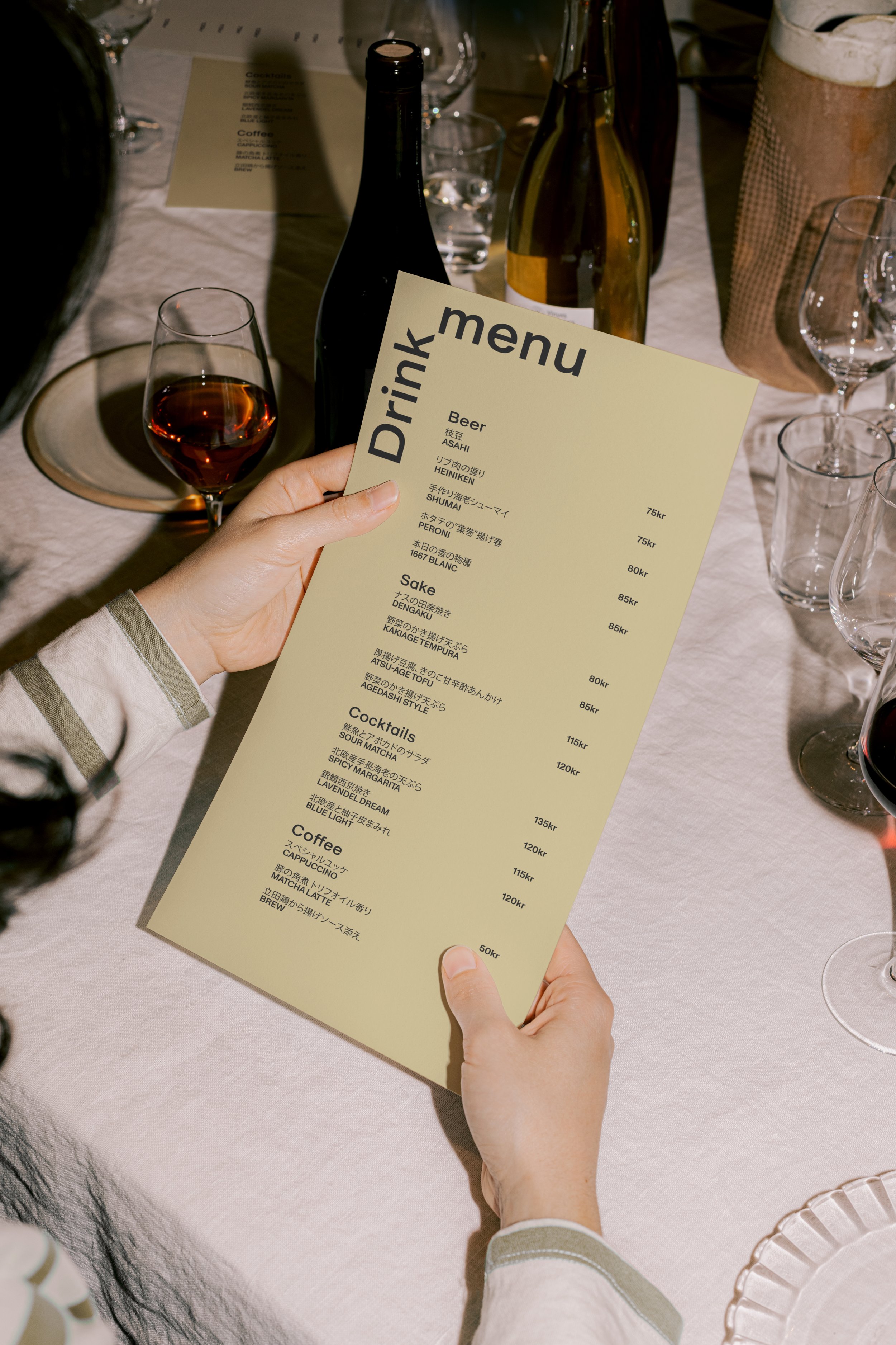
B.L.Y’s current design feels dated and general - not making the restaurant and the food justice. The restaurant provides elegant, well made dishes but from the outside it could be just one of the many sushi places around town. The identity should be modern and feel trustworthy to better match the inside.
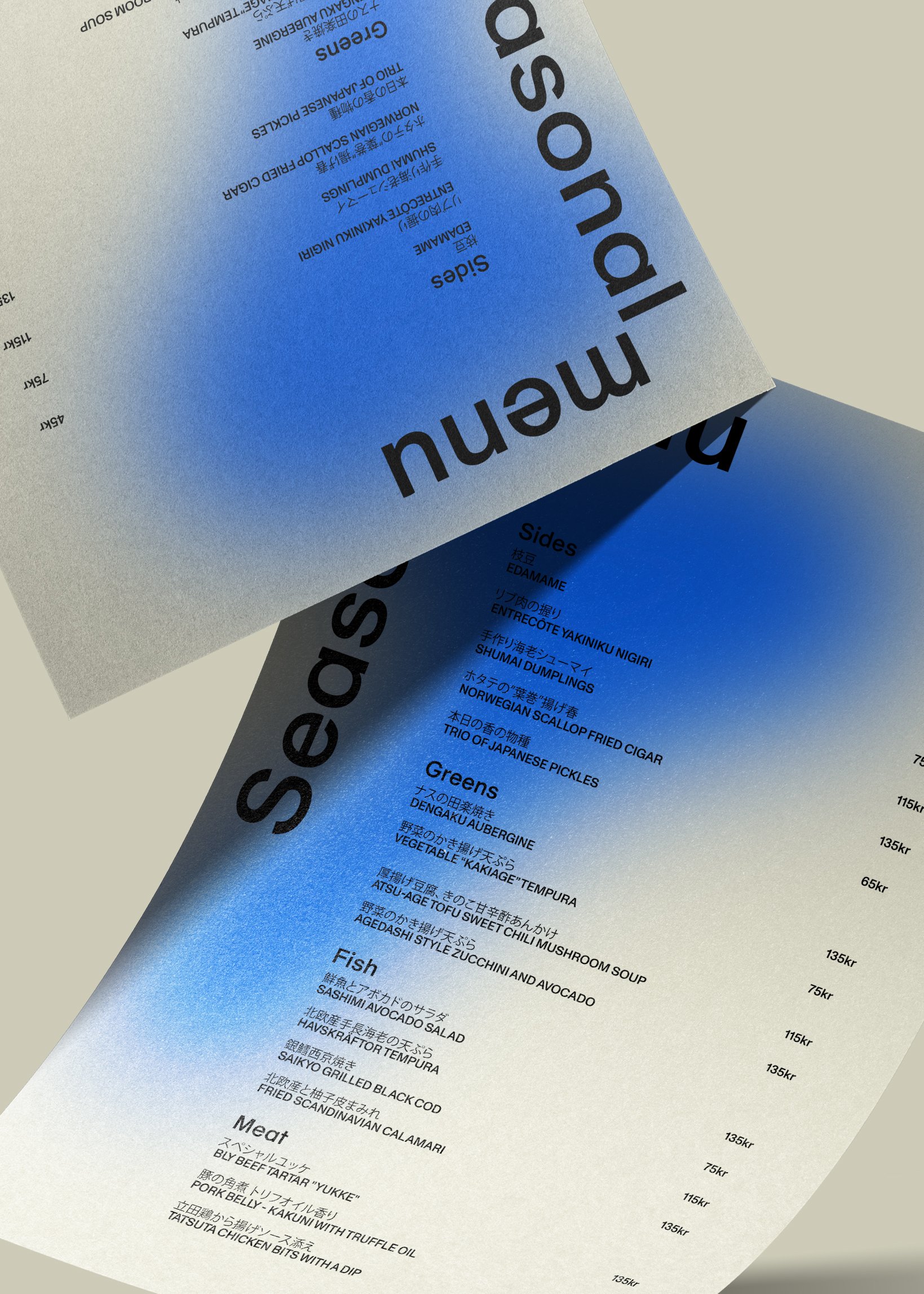
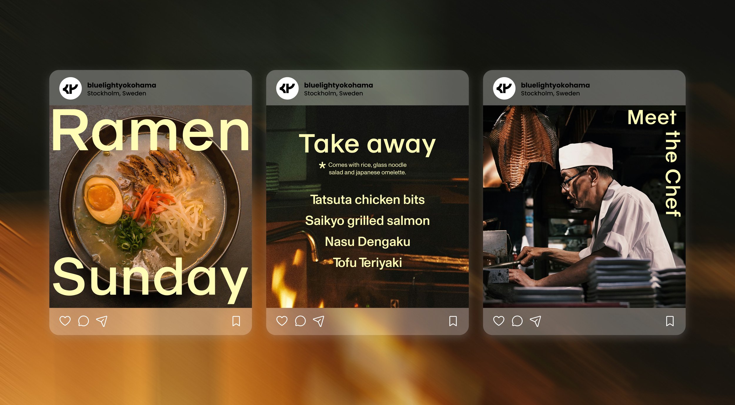
The symbol consists of the three first letters in Blue light Yokohama matched with a flexible logotype that fits in every corner. The round shapes of the symbol is inspired by the classic ramen bowl, making a homage to BLY’s Ramen Sundays. And what would Blue light Yokohama be without a blue bright color?
