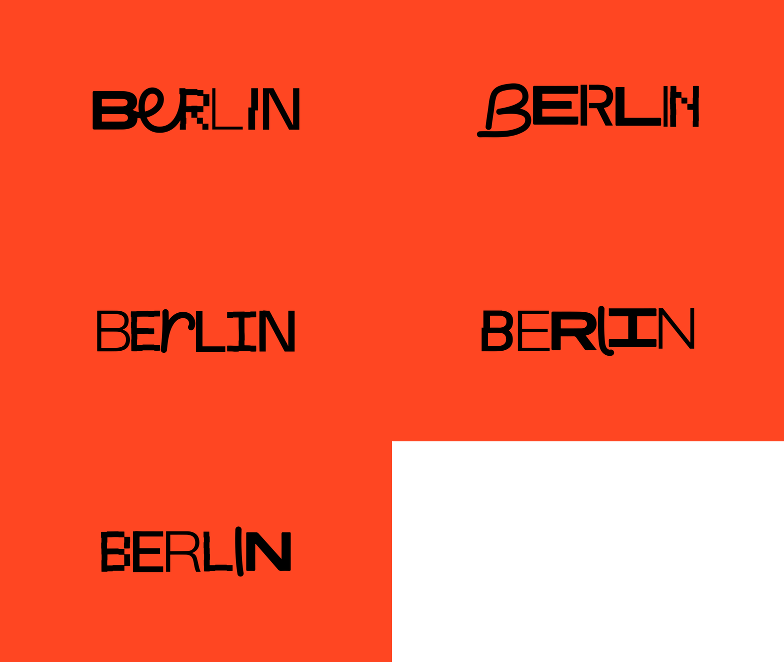
BERLIN FILM FESTIVAL
– Diverse, independent, daring
The Berlin Film Festival, also known as Berlinale, is one of the leading film festivals in the world, along with the Venice Film Festival and the Cannes Film Festival. But compared to the other two Berlinale stands out with its wide range of competition categories. Alongside the main competition, there are various sections such as Panorama, Forum, and Generation, which focus on different kinds of cinema, from independent to avant-garde to films targeted at younger audiences.
The programme is described as diverse, independent and daring.
So I wanted to make the identity reflect that.
To encapsulate both the festival's diversity and Berlin's unique character, the logotype incorporates an eclectic mix of fonts and styles, matching the hand drawn illustrative style with the boxy hard type. For the festival's 74th edition logotype the box from the original logotype was reused but matched with more playful numbers to get an additional layer of yet a different feel. Despite the seemingly chaotic mix of styles, a unifying 3x3 grid brings order to the identity, with each grid box representing one of the festival's nine categories. The grid is expansive which means the design will vary across various formats. To make the identity stand out even more it was matched with a bold color palette – making the streets of Berlin really pop on a gray February day.


