Änglamark – Rebranding packaging design
Änglamark is the organic brand of Coop - the cooperative grocery chain. The organic brand saw the daylight in 1991 but even before that they made some crucial changes in the food industry.
They made it possible for farmers to grow organic food and sold it in an all-organic grocery store. Their vision about products that were good for animals, humans as well as nature seemed to be a long way to go but is a given today. Änglamark is clearly a cool, revolutionary brand seen from their history but why isn’t that seen in their packaging?
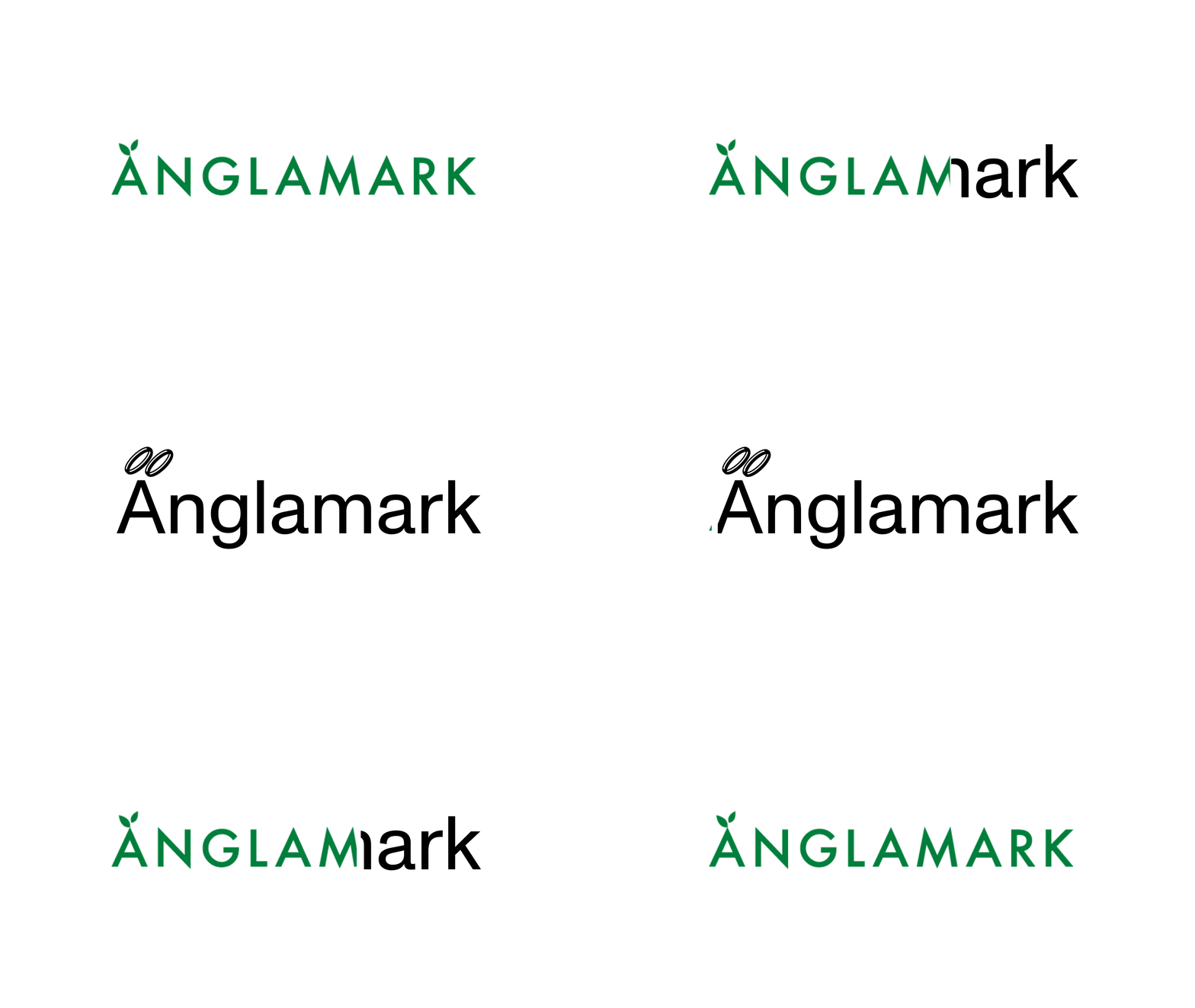
The stiff logotype was changed to a more playful style inspired by halos (änglamark is directly translated to “angel ground”) and to match the illustrations on the packaging. With the illustrations every product tells us a story - an angry bee next to a thief picking flowers on the honey and a girl doing laundry, hanging up her mask she wears to work, on the washing powder. The goal was for Änglamark to be like a confident, cocky little sister - from design to communication. Bringing communication on to the packaging with lines like “We want to keep talking about sustainability, so sue us”. Every design and communication-move was built from the idea of Änglamark as unpretentious, laid back and up front.


